The Best Call To Action (CTA) Button
Your website needs the right call to action to convert website visitors to leads. Let's look at the top tips for a great call to action button and how we designed our Leadbox with these principles to boost conversion.

Call to action (CTA) buttons are used in your website to guide users towards your goal conversion. In our experience, the important fundamentals are making sure your CTA button is no/low effort to click or tap and that it markets the communication options a consumer has to engage with you.
Let’s dive into tips for creating the best call to action button for your main CTA … to contact you.
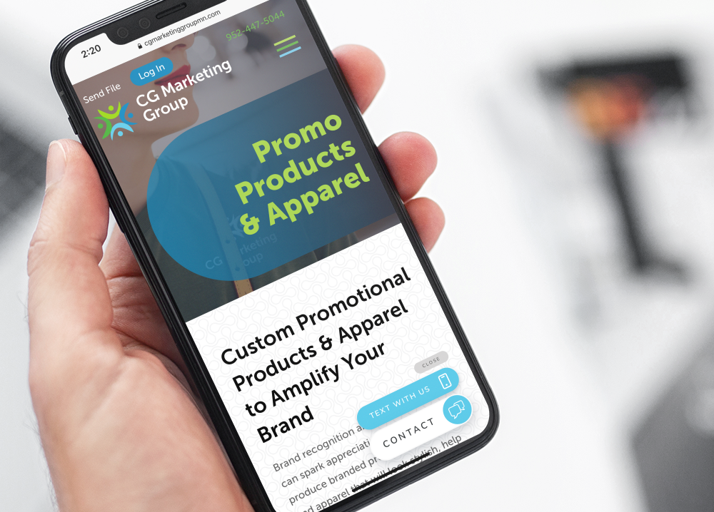
I’ll also outline how we incorporated these into our Leadbox widget to convert website visitors to conversations. The Leadbox is Leadferno’s floating call to action button for a website visitor to start texting with you or another conversion goal you have created like click-to-call, email, estimate form, book a meeting and more.
1- Be action driven
Great calls to action are straight to the point and drive an action. Clarity and relevance win the day with your call to action providing your website visitor with a clear next step and expectation. It’s a bonus when your CTA can evoke emotion or enthusiasm with the user.

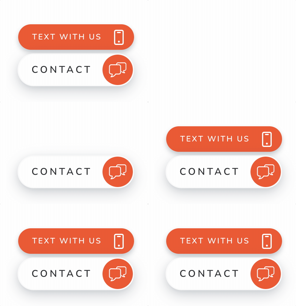
The Leadbox has a two-part CTA to be action driven. The first is the primary button that clearly drives the user to CONTACT you. The secondary button allows you to market the contact options. Our standard “Text with us” is a great way to advertise that SMS is an option to communicate with you. Most businesses don’t offer two-way text messaging from their website, so it’s a great differentiator to promote.
Marketing your channel options to communicate can evoke an emotion of trust and even delight for a consumer when they see that they are in control of the conversation with the options they want.
With the Leadbox, your secondary CTA can be customized, so additional examples you could use might be:
- Call or text us
- Text, call, email
- We can help
- Ask a question
- Book appointment
- Reservations
- Schedule with us
2- A button that draws the eye
There are a few components to a call to action that draws the user’s attention. These need to work in combination for a CTA button that is visually appealing, well designed and stands out to your website visitor.
Color
It’s important for your CTA button to stand out, but not offend. Using an on-brand, but contrasting color from your web design palette. Designating an “accent” color that that is used for your CTA buttons is a great way to build consistency for the user. When you see “green” or “orange” they know an action can be taken. Bottom line is your CTA button color should grab attention while staying within your design.
Style
Opinions on design style can vary greatly, but in this case you want to go with some of the staples. Adequate spacing or “white space” of the button design and elements is a must. In fact, I’ve rarely come across design with too much spacing on the web, just tons of things not spaced enough. The next element of style is a clean and easy to read font. Lastly, your best style is a clean look, so don’t get too intense with any element of your CTA button.
Movement (Bonus tip)
Adding slight movement to draw the eye can be a big help. Stay away from anything overdone or distracting, but a simple and calm movement can help your call to action stand out making the website visitor aware it’s there.

Our Leadbox widget takes all of these into account fro our base design to the customizations you can make to it. The button shape features nicely rounded corners to look great on any website with a nice contrast from your accent color and it’s white font and button outlines. You are able to choose your accent color from the tones we detect in your logo or input any custom color you want.
Finally, our main CTA button is instantly visible with the first load, but our secondary CTA appears above it 3 seconds later, sliding in to draw slight attention to the contact options with motion.
3- An always visible contact call to action
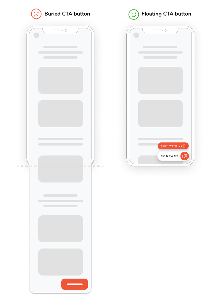
While many websites have improved over the years by locating contact links or buttons on common areas you can do better. Having the contact CTA in your header, main navigation or footer are good, but having your contact CTA always on screen is best using a floating CTA button. Then, no matter what part of your website, page or content your user is viewing they can contact you instantly.

Today’s mobile experience often requires many scrolls of the thumb to get back to the top menu or down to the footer and you should be making it easier for those that want to contact you.
Our Leadbox widget checks the box here too by being always visible floating button in the lower right of desktop screens and the bottom of mobile browsers. Remove the friction for your website visitors and keep your call to action to work with you front and center.
Go and create the best call to action button
Now that you have our guidelines to a great CTA button to contact you, make it happen. We think we’ve created the ultimate cheat code by using Leadferno and our Leadbox widget, but you can apply these tips to any CTA you want to use. Having a strong call to action button gets the conversation started so you can respond quickly and help your prospects and customers.
Similar posts you may be interested in:
Categories:

Get our monthly update covering SMS, messaging, and Leadferno features.