5 Tips To Increase Website Conversion
Actionable tips to improve your website conversion and capture more leads from your web traffic.

Driving traffic to your website get’s a lot of attention in both effort and budget, but conversion is your top goal. Those conversions might be sign-ups for your newsletter, email capture for a PDF download, a lead form fill, or a purchase.
You want to turn as many unknown lurkers on your website into a known lead. Conversions drive leads and ultimately sales. Here are five ways to boost your website’s conversion rate.
1- Better Website Headlines
Mastering headlines can increase conversions across every page of your website, especially your home page. A well-crafted headline grabs the attention of your audience, conveys the value of your offer, and entice visitors to take action.
Great headlines build trust, and trust is what conversion needs. This is especially true on your home page, where the headline is a main greeting of your user.
Poor headlines have one main thing in common. They are too vague. It’s a headline that could apply to ANY business instead of the specific services, products, or differences you offer.
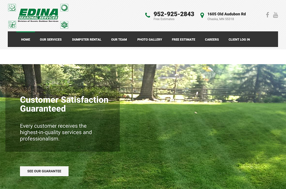
Here is one example of such a vague headline by stating “Customer Satisfaction Guaranteed”. This headline can be true of any business. Even their intro content below the headline is vague and doesn’t mention any of their specific services or service area.
Here are some key strategies to help you become a master of conversion-focused headlines.
Clarity
The foundation of an effective website headline is clarity. Your audience should instantly understand what your offer is and how it benefits them. Avoid headlines that leave visitors guessing. Instead, be direct and concise.
Clearly communicate your unique value proposition in a way that resonates with your target audience. Use language that addresses their pain points and needs. When visitors know exactly what’s in it for them, they are more likely to stay on your page, explore further, and ultimately convert.
Promise compelling benefits
People are driven by the desire to solve their problems and fulfill their needs. Your headline should promise a clear and compelling benefit to your audience.
What will they gain from your product or service? How will it improve their lives? Make sure your website headline focuses on the outcome and transformation your offer provides. Highlight the most significant benefit that sets you apart from competitors.
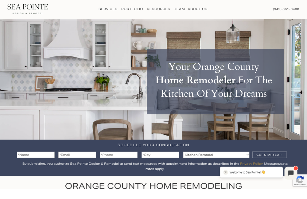
Here is an example of a good website headline with clarity and the benefits they can provide. It covers the what they do, where they do it, and the outcome of their offering.
Start creating better headlines
Now you have an understanding of how to create headlines that are clear, inviting and build trust. Here is a basic framework for small busiensses to get you started.
Headline framework: Service + City/location + Benefit
These can appear in any order and might look something like this:
- Minneapolis Home Painter to Refresh Your Home
- Small Business Accountant to Help Your Phoenix Business Grow
- Get a Dream Backyard With Tampa’s Best Landscaping Company
Conversion Bonus Tip: If you accomplish a headline with clarity and benefits, you might be able to add a bit of intrigue or emotion as well. Use words or phrases that pique curiosity and spark interest. Examples are discover, game-changer, exclusive, surprising, and inspiration.
SEO Bonus Tip: Your leading headline that is structured as your H1 headline of your website code is an important on-page SEO element. For most small businesses you want to include the service focus of that page and your location.
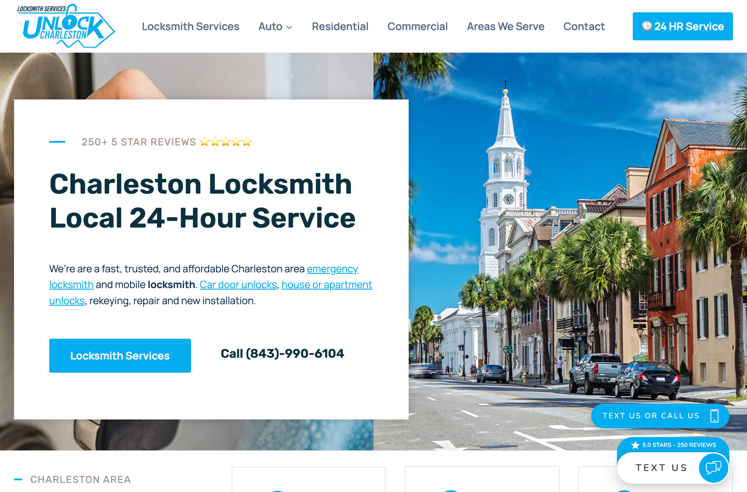
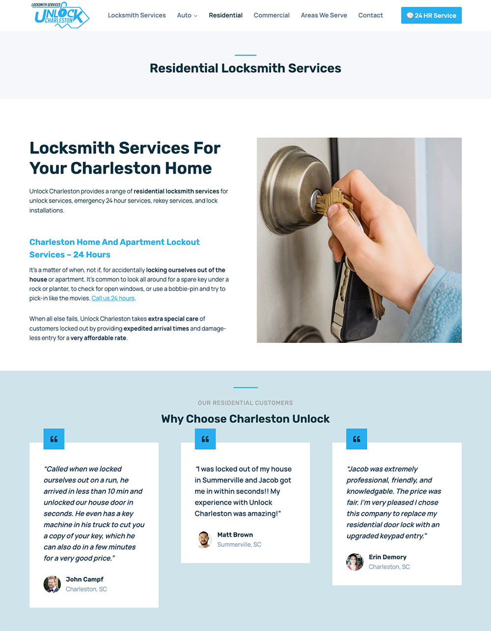
Combining these elements with social proof and internal links to your most important service pages can be a solid lift in both SEO visibility and conversions. This locksmith’s headline and intro text with internal links is a great example.
Mastering headlines that increase conversions is a combination of art and science. It involves crafting clear, benefit-driven, and audience-specific headlines while incorporating elements of curiosity and engagement.
By continually testing and refining your headlines based on data and feedback, you can fine-tune your approach and achieve higher conversion rates, ultimately driving more leads and success for your web pages.
2- Social Proof
Social proof plays a significant role in shaping a website visitor’s experience and their likelihood to convert into a lead. Displaying that social proof provides a shortcut for prospects to trust you quickly.

Testimonials, reviews, ratings, certifications, influencers, industry associations, and awards can enhance trust and credibility. When visitors see that others have had positive experiences with your product or service, or that your business is certified or award winning, they are more inclined to trust your brand and feel confident in their decision to engage with you.
If you you sell to other businesses, logos of the businesses that you work with is a great trust signal in B2B.
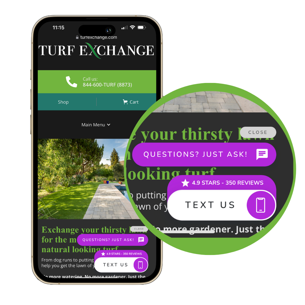
Conversion is the reason Leadferno gives you the ability to show your reputation in your Leadbox buttons with review count and rating display. The example below shows how Turf Exchange displays their 4.9 star rating with 350 reviews on every page of their website.
Social proof validates your value propositions by demonstrating that your offering delivers on its promises. When visitors see real-life examples of how your product or service has benefited others, they perceive its value more concretely.
This validation reassures them that choosing your brand will fulfill their needs or solve their problems effectively.
Social proof supports your marketing claims
Using your reviews or testimonials to back-up the marketing claims your website content makes is a high-powered use of social proof. While many websites post their reviews or testimonials to one focused page, that’s not the best way or only way to use them.
The best pages are filled with evidence.
Andy Crestodina, Orbit Media
Conversion expert Andy Crestodina shared this tip on a recent podcast interview “Put that social proof right next to the claim it supports so that it’s relevant.” Andy outlined how isolating reviews or testimonials to just one page lessens their impact, but using them to support many or all of your website pages is powerful. “The best pages are filled with evidence.” shared Andy.
The example below for residential locksmith services includes customer generated content from three reviews specific to homeowners and their outcome working with Unlock Charleston.
Their car door unlock pages feature reviews mentioning that service. It’s more relevant and it supports the marketing claims, just like Andy recommends.
3- Shorter Forms
Shorter contact forms and lead forms on websites act like streamlined highways, smoothing the path to conversion by reducing friction, enhancing user experience, and accelerating the journey to valuable leads.
As a marketer or sales person, we value a highly qualified lead, but leaning into qualification over getting your prospect to take their first step isn’t the best move. Every field or question you add to a form increases the odds of it not being started or submitted.
In our contact form examples below you can see how the form on the left, with 12 fields and questions total can feel like a brick wall to a prospect. It’s asking too much to fast instead of just getting the conversation started like the form on the right, with just 5 fields, and using your sales process to further qualify the lead.
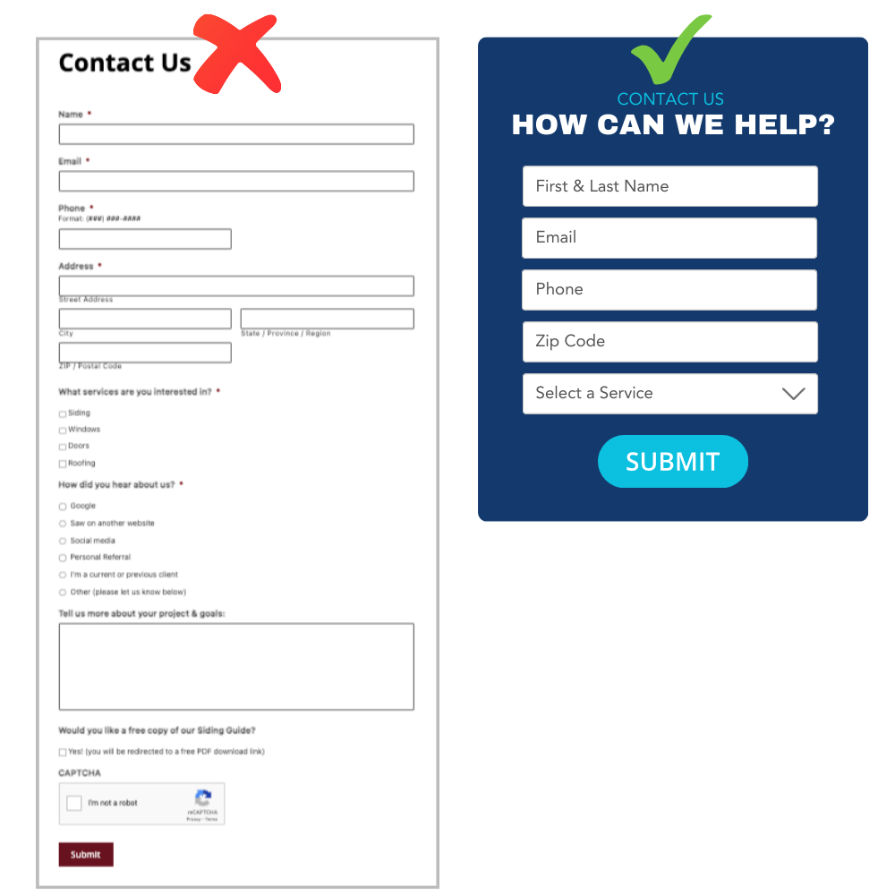
Less fields, less friction, more leads. It’s always about making your business easy to work with.
In addition to shorter forms being more approachable for prospects, consider these benefits for conversion as well.
Mobile-friendly
Shorter forms are particularly beneficial as they are easier to complete on smaller smartphone screens. Mobile users are less likely to engage with lengthy forms or complex field types. Shortening your forms can improve conversion rates for mobile. With most sites getting 50% of more of their traffic from smartphones, you need to tailor to the mobile experience.
PRO TIP: It’s a simple thing, but use and test your form experience from your phone. There is nothing better than understanding the effort it takes to engage with your company first hand.
Increased Completion Rates
Shorter forms typically have higher completion rates because they require less information from visitors. By only asking for essential details you lower the barrier to entry and make it more likely for visitors to submit the form.
Overall, shorter lead forms or contact forms on a website improve conversion rates by reducing friction, enhancing the user experience, increasing completion rates, catering to mobile users, attracting higher quality leads, and enabling faster follow-up. By optimizing your forms for simplicity and efficiency, you can maximize conversions.
4- Authentic Media
If a picture is worth a thousand words, don’t waste that value on photos that are not of your business. Conversion thrives on trust, so having real photos and videos of your business, staff, and customers is a must.
While stock photos feel like a quick win for professional website images, they don’t accomplish what is really needed for your prospects, and that’s authenticity.
Getting good photos and video content for your website has never been easier. You might have someone on your team that is into photograph. You can also hire a local pro for a day to shoot as much content as possible. That phone in your pocket is more than capable of taking good enough photos with the right angles, lighting, and other elements.

Getting your own photos and video taken gives your business and your website the following:
- Authenticity – it’s you, your team, your customers
- Brand identity – original visuals showcase your unique brand
- Personal connection – prospects and customers see the people and elements that will be helping them
Authenticity builds trust quickly, which boosts your conversion. So drop the stock photos and get real with your website photos and media.
5- Add Texting, Right From Your Website
There is too much experience and data at our fingertips to ignore this one. Texting is the preferred channel people use to communicate, over phone calls and emails.
Combining the ability to text right from your website makes reaching out to your business easy. On average, we see a 15% increase to conversion rate just by adding SMS as a lead channel via our web-to-text widget, the Leadbox, to a website.
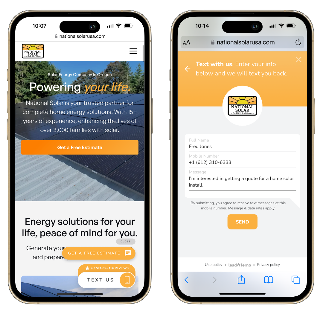
When we look at our previous conversion tips in this article, texting folds right in with many of these.
- Texting is easy and a low friction channel
- Texting is trusted – messages get delivered and read
- Texting is authentic – it’s a personal communication channel
There are key benefits to using a widget like the Leadbox with a short form to start your text conversation over just linking a number consumers can text.
- It works on any device including desktop/laptops. If you just link a number, it won’t work on many desktops and that’s likely 50% of your traffic unable to start a text.
- You can track the SMS leads – what page it came from, when it converted, etc.
- You capture their name allowing you to instantly personalize the conversation without any further questions.
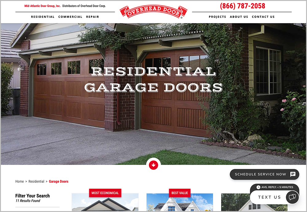
What about live chat?
When most businesses think of adding a real-time lead channel to their website, they think of live chat.
While live chat can benefit some websites and businesses, we’ve found that web-to-text is far superior in a number of ways. It’s easier to use for the consumer, leveraging the most used app on their phone. They can take the conversation anywhere and not be stuck in a chat window.
For the business, it’s easier to manage and have more staff engaging with text messaging since they all know how it works. Lastly, our studies show consumers have very realistic expectations of a text conversation versus a reply time from live chat. And that’s important to keeping them happy.
Text messaging is a channel your business needs to offer and leverage for more leads and better communication.
Start Capturing More Website Leads
These five tips can go along way to increasing your website conversion and lead capture. Ultimately you are focusing on making your business easier to work with and building trust as quickly as possible. There are even more ways to foster these core elements as you get these five nailed down to increase conversion.
Similar posts you may be interested in:
Categories:

Get our monthly update covering SMS, messaging, and Leadferno features.