Leadbox: The Web To Text Widget For More Leads
The Leadbox converts website visitors to text message conversations. See how our web to text widget is an incredible combination of design, customization and conversion.
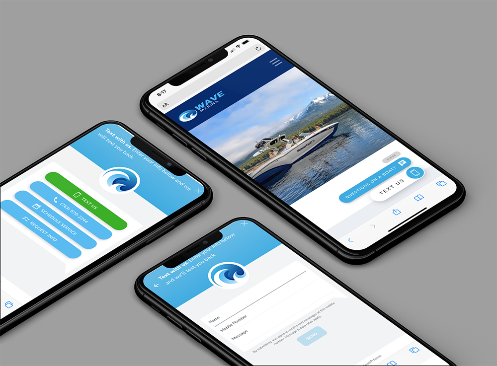
Your digital marketing success is driven by the consumer’s last action. Did your website traffic convert to leads? We designed the Leadbox to power your conversions by giving you a branded, customizable and easy-to-use web-to-text widget that gets noticed to drive action.
Let’s look at the numerous options and advantages the Leadbox web to text widget can bring to your website and conversion strategy.
Beautiful and branded design
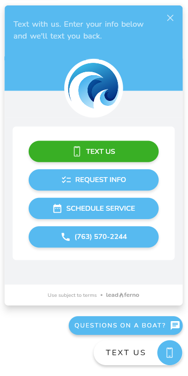
The overall look and feel of the Leadbox is designed to be clean, intuitive, and stand out. Our goal is for the Leadbox widget to be the best-looking element of your website.
Customized to your brand
Looking great means looking exactly like your brand. Our widget displays your logo and selected brand accent color to not just connect the website experience, but to also stand out as a beautifully designed feature that attracts action.
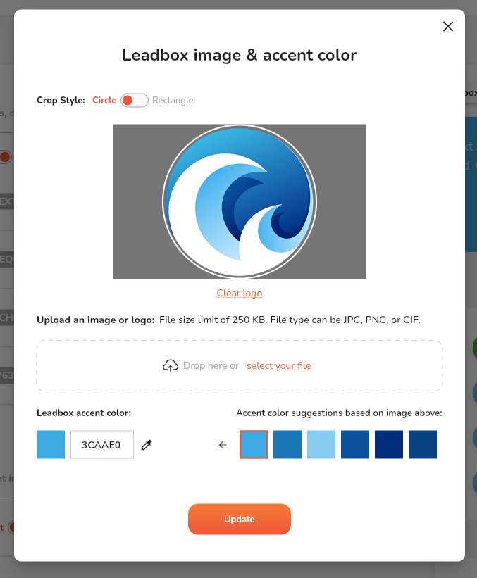
We make the process of customizing your Leadbox as easy as possible.
When you upload your logo we then scan it for the most common colors being used for a one-click selection as the accent color. If you need to use a specific color, not in your logo, you can use our color picker or input the exact HEX color code.
Buttons to drive action
Our web-to-text widget has a set of CTA buttons to drive the action of connecting with your business. These buttons each have their own role but combine for the goals of usability and conversion.
Primary CTA button
The Primary button is always visible on any screen, desktop or mobile. The Primary button has the following options for display:
- Button with icon and text or icon only
- Text display options of “Contact”, “Text Us” or “Message”
- Two icon options of a double chat bubble icon or mobile phone icon
- Highlights for social proof or offers (reputation, reply time, custom)
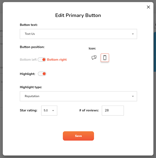
When editing the Primary button you can also control what side of the screen you want the Leadbox to anchor to. Choose from the bottom right (default) or the bottom left.
Highlights
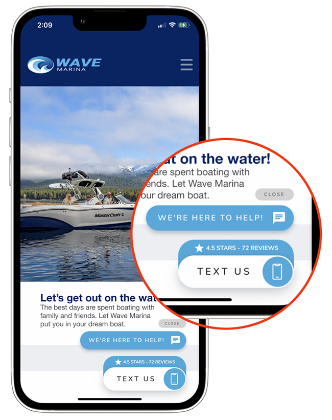
Highlights allow you to use social proof, offers, and more to boost attention, trust, and conversion with your Leadbox buttons. This feature is located in the Primary button settings and includes three Highlight types to use.
- Reputation – display your review rating and count
- Average reply time – give prospects a reply time frame
- Custom – up to 22 characters for offers, social proof, special services, and more.
Secondary CTA button
The Secondary button appears on the page above the Primary button 3 seconds after the page loads. This button uses motion to further grab the user’s attention.
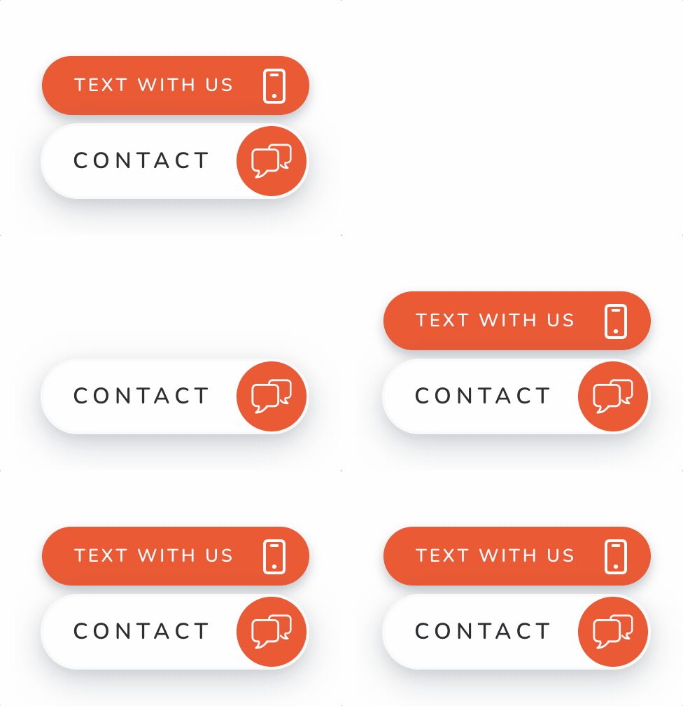
The Secondary button has a wider set of options when creating your call to action allowing you to use any combination of words up to 20 characters combined with 22 icons.
Although there are endless options that might work for your business with this button, these are some of the common Secondary CTAs we see:
- Text with us
- Text, call, or email
- Get a free estimate
- Request an estimate
- Make an appointment
- Schedule a meeting
- Schedule a demo
- Questions? Ask us!
- Get quick answers
- Work with us
- Book a time with us
- How can we help?
Combining the proper icon with your button content provides a visual cue to reinforce your call to action.
PRO TIP: Market that you offer texting
Since the ease of texting with a business is undeniable, you want to make sure you are marketing that you offer texting as a communication channel in one of the buttons. If your Primary button is using the “Text Us” content you can then use any call to action in the Secondary button.
If you are using just the icon for the Primary button, or using “Contact” or “Message” you will want to use the Secondary button to mention texting. The Leadbox gives you endless options to create an outstanding call to action that advertises you offer text messaging.
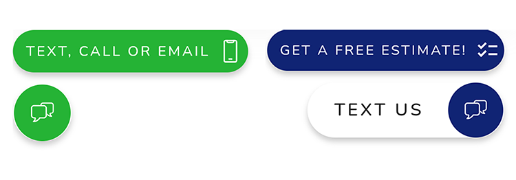
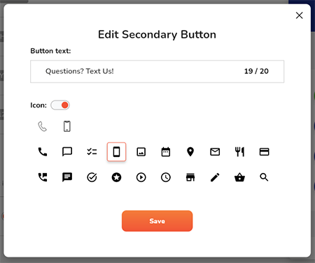
Here are just a few examples of possible button combinations.
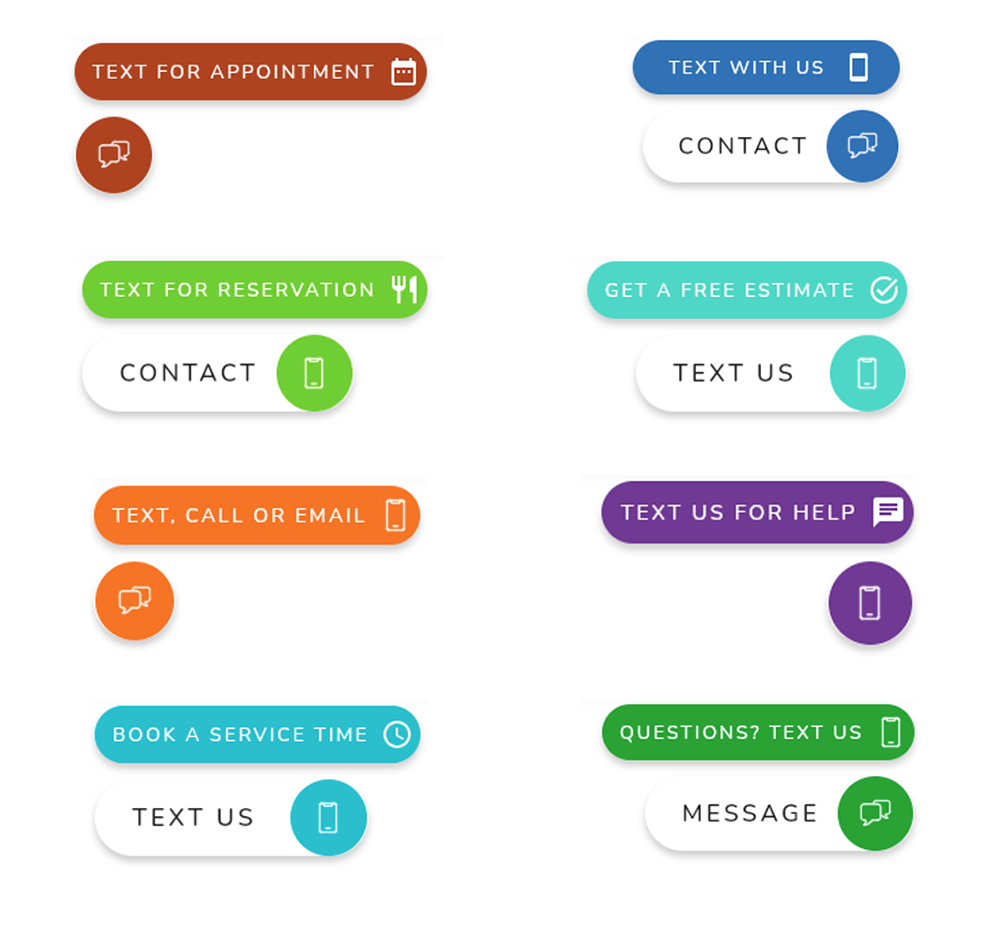
🔥 Want your own beautiful buttons? Start your free trial and have the Leadbox buttons on your website in minutes.
Conversion modes for web-to-text or Channels
Customization doesn’t stop with the Leadbox buttons, it carries into the next step(s) of the Leadbox widget as well. Once the buttons are clicked or tapped you also can customize the next step and options to meet your needs. Let’s look at the two conversion modes and their options.

Text only mode for web to text
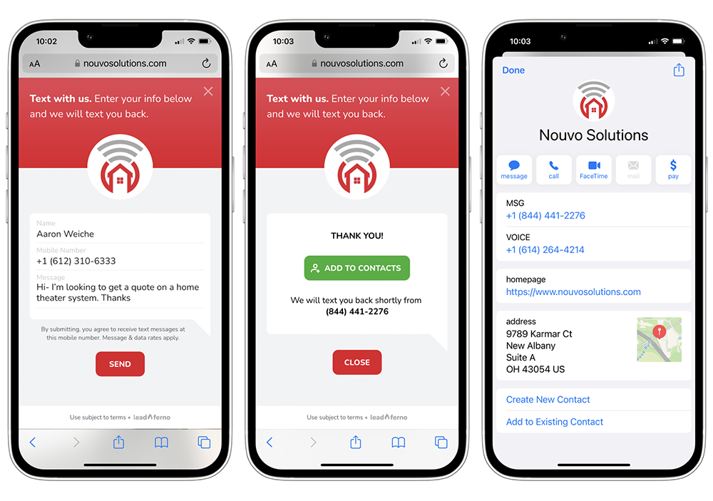
The Text only mode is focused on starting SMS conversations quickly. With this mode, once the Primary or Secondary Leadbox button is clicked the consumer inputs their name, mobile number, and their message to start the text conversation. Completing this form sends the submitted information into the Inbox and instantly texts an Auto Reply to the consumer.
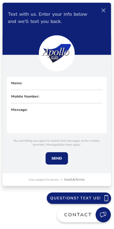
This process to start a text conversation is a fast process on a desktop browser, it’s lighting fast on mobile. The tap to open the text input form allows you to tap to fill the fields with ease.
Channels mode for custom calls to action
The Channels mode lets you offer even more choices for consumers to convert from your website. You can display up to four calls to action, including your CTA to “Text Us”. These additional CTAs can be a click-to-call or linking them to any page on your website or any URL on the web.
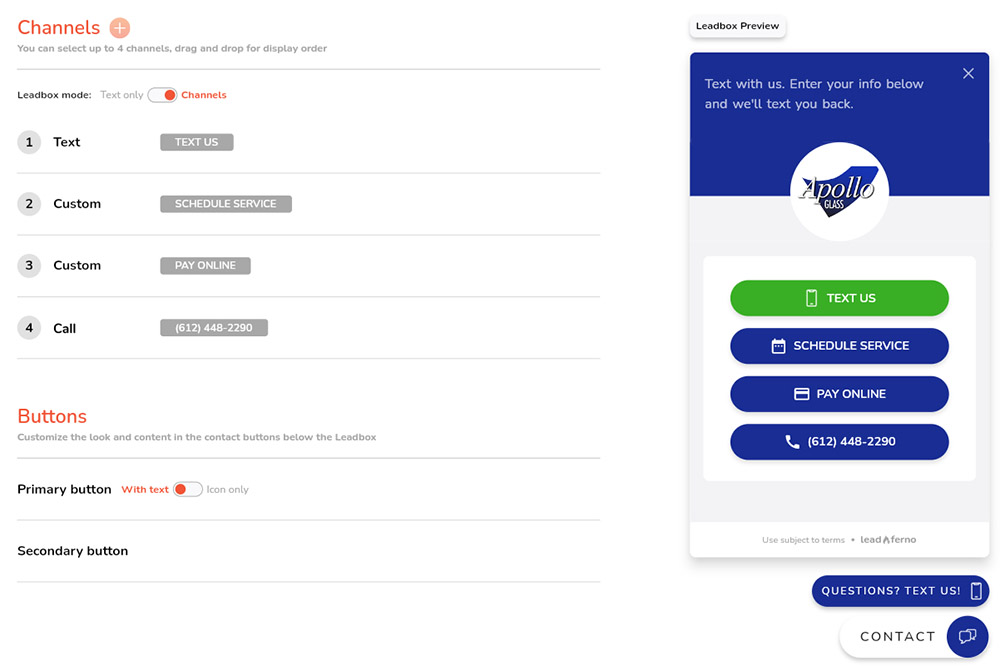
Some Channel CTA examples you might use are:
- Book appointment – links to your scheduling app like Calendly or SavvyCal
- Free estimate – links to your web form for an estimate
- Buy a gift card – links to your gift card purchase page
- Reservations – links to your reservation page or your OpenTable profile
- Newsletter sign-up – links to your email sign-up list
- View reviews – links to your page with testimonials and reviews
- Schedule a demo – links to your demo or booking form
Using the Channel mode really opens up the conversion options for consumers and the business. It allows you to place your top call to actions in front of the user at all times, on any page of your website.
Multiple profiles and multiple locations
The Leadbox is built to grow with your needs. If you move up to managing multiple Inboxes, like one for sales and one for service, it will adjust to ask the user what their need is and then present the contact options for that department.
If you have 3 locations or even 300, the Leadbox has a Locator to allow the website visitor to select the location they want to contact by searching for the name, address, or city/zip as well as a scrolling list to pick from. These reasons are just a few more that our web-to-text widget is the most flexible one out there.
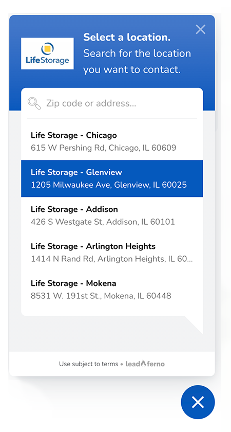
Get into their phone contacts
Once a prospect completes the text form they get a confirmation in the Leadbox that it was sent and a button to add your business to their contacts. This is a great way to become a known and trusted contact on their phone.
Being in their contacts makes your calls and texts known, a massive help in this day of robo-calls and spam calls. It also helps the ease of repeat business and referral business as sending a friend or co-worker your contact over text is simple.
More than a web-to-text widget to generate more leads
The elements and capabilities of the Leadbox add up to be the best call to action on your website. With all of the options available, you are best to test the content you are using in the buttons, the conversion mode, and more to find the winning combination to produce the most leads.

Get our monthly update covering SMS, messaging, and Leadferno features.