Lead Form Examples – Flexible & Powerful Lead Capture For Conversion
Not all lead forms are created equal. You need a lead form that is flexible, but optimized for conversion and closing sales.

High-converting lead generation forms, or “lead gen forms,” are essential tools for collecting needed information from potential customers. Lead forms are the most tried and true staple of website conversion, turning unknown visitors into a known lead.
Based on the business or service type, the fields a lead form needs can vary. Then factor in the business’s website design, where you form(s) are located can vary as well.
Lead form examples
Here are just a few examples of the flexibly of Leadform. It can go anywhere on a webpage or website you need it, even serving as a full contact page.
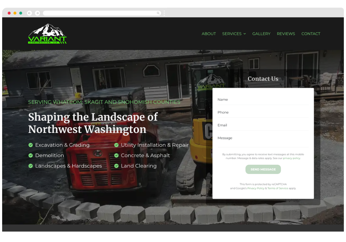
Hero lead form
This location is very popular with home services companies. It puts the lead form right in the “hero area”, the first section of your website that appears. This puts your form and CTA in view right away on the home page and other landing pages.
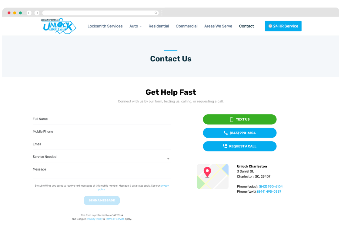
Contact us page lead form
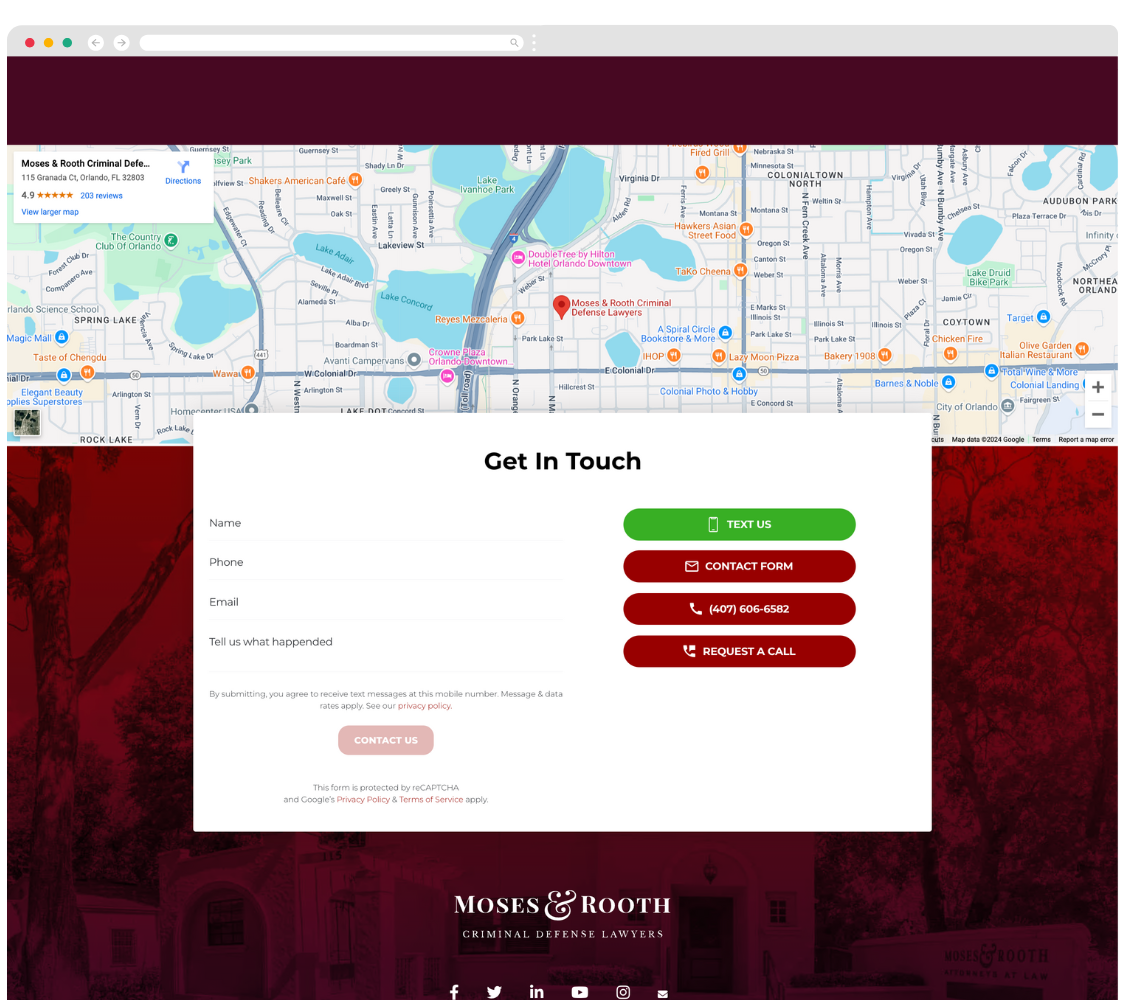
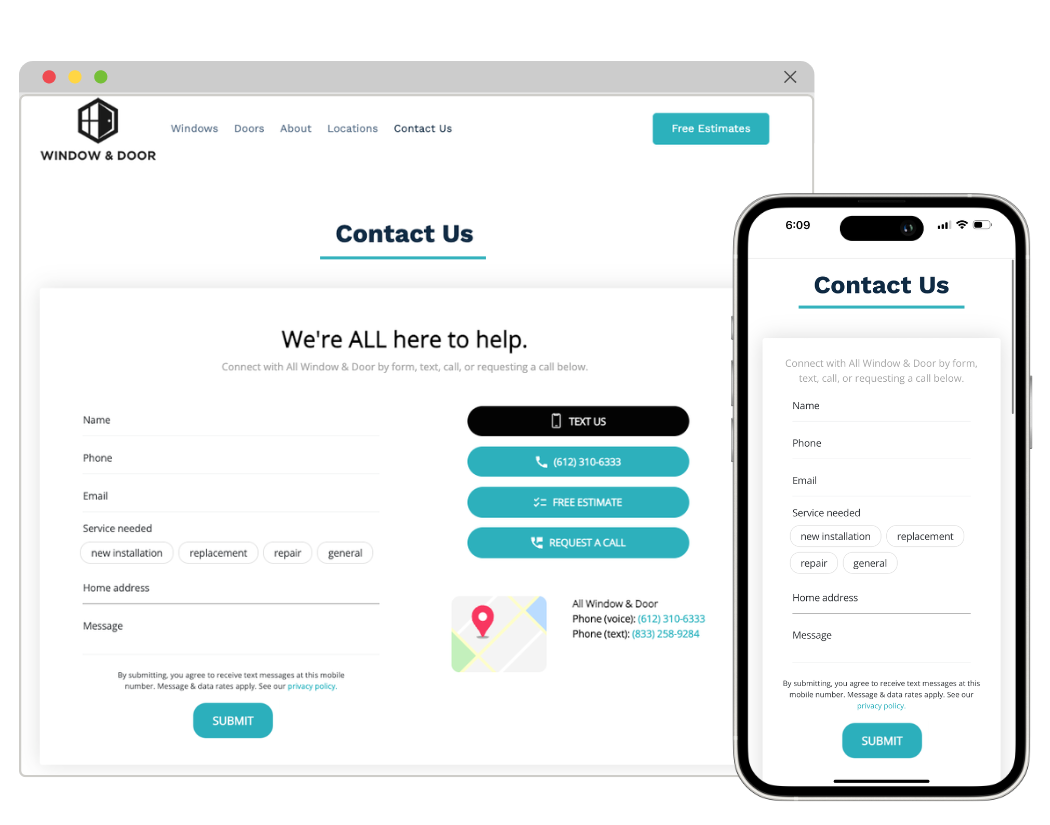
The contact page is the most common location of a lead form for small businesses. The form displays along with your contact info like phone, email, and location.
Our Leadform feature is unique with its options to expand past just a form to a full contact page. Leadform has settings that allow you to display other CTAs to text the business, request a call, click to call, and the location.
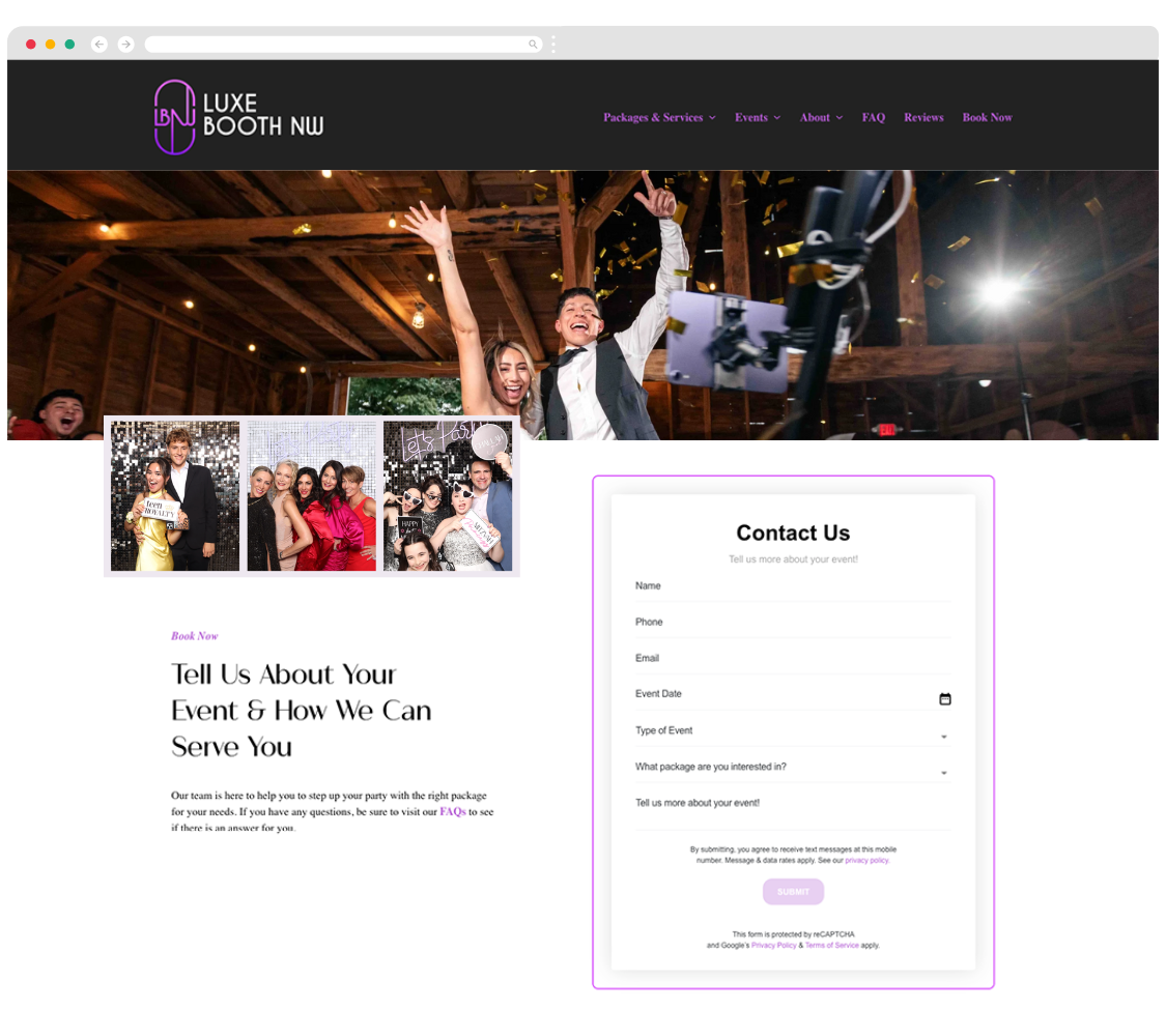
In-page/content form
Adding a lead from in the content of your page allows your form to exist within the user experience of your content and page.
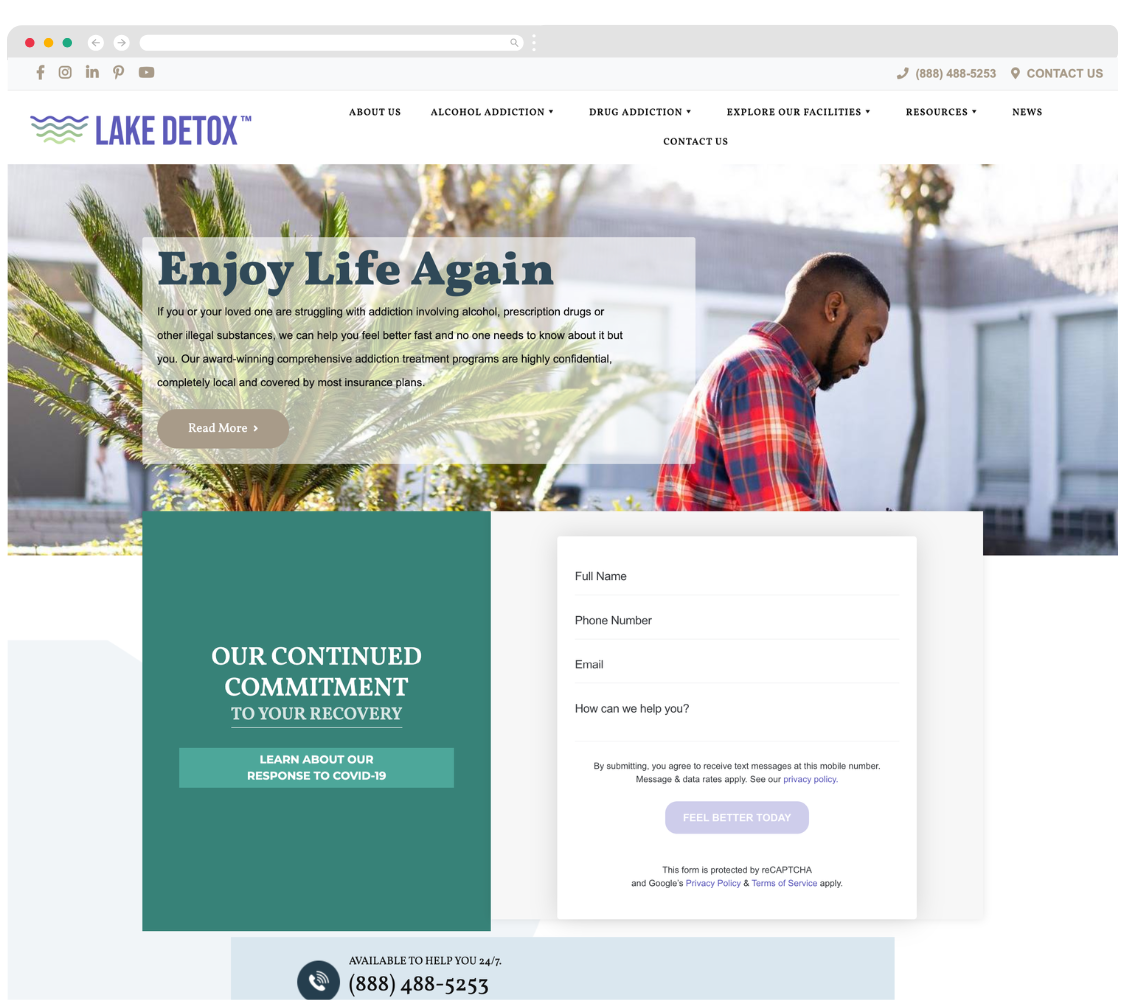
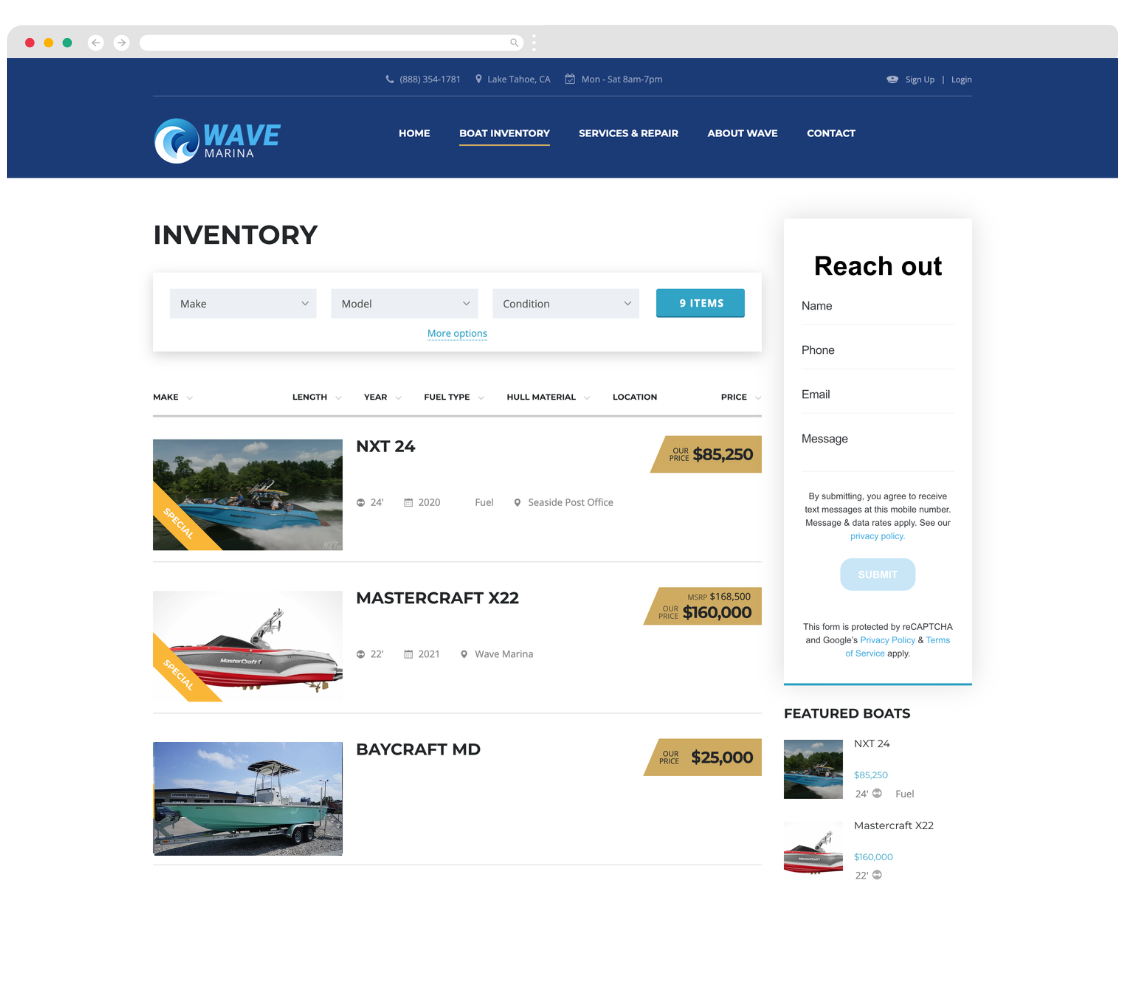
Sidebar form
Pages with high value content might have most of the page dedicated to it’s display, but still have a side bar (narrow column) for a form.
Footer form
Adding a form to your footer places this conversion option on every page of your website. This also places the form at the end of your website visitor consuming all of the content on that page or scrolling to the footer to look for a next step (contact options).
The right lead form in the right place
These examples of where your lead form can be placed highlight that there is no one location that is best. With the right lead form solution you can deploy and test your forms in different places on your website and web pages to learn what captures the most (or best) leads.
What fields to use in your form?
The short answer … only the ones you need. The purpose of your lead form is to capture and create as many sales opportunities as possible. Some research has shown 5 or less fields boosts conversion.
Adding too many fields can reduce form completion rates, especially if potential leads feel it requires too much effort. Optional fields can be helpful, or even help you better qualify a lead, but the fields you present should be non-intrusive.
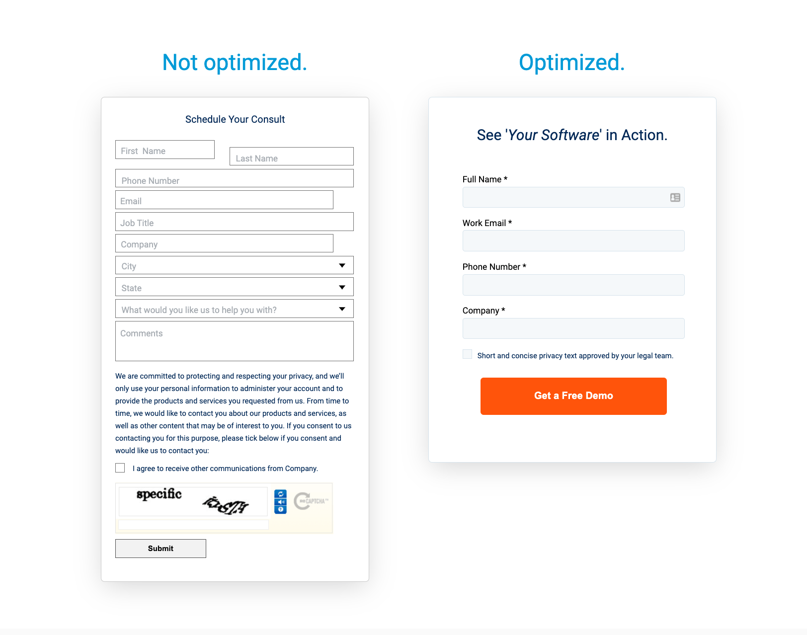
Optimize your lead form to capture what you need, not what you want, and follow the golden rule of being “easy to work with“.
A better lead form solution
Now that you have a better idea on where to place your lead forms and what to capture you can choose the form builder and solution to get leads.
Leadferno’s Leadform is a new generation of lead form. It has features other form builders do not for huge flexibility, and it’s powered by SMS to massively improve reply times and conversions.
Leadferno agency partner Brand Market Media uses Leadform with their clients. Brand Market Media CEO Michael Morsecheck knows that conversion is boosted by ease of use and fast responses and shares how this is key.
Our clients love Leaderno. It’s easy to quickly connect with prospects. By integrating Leadform on the website, form submissions are now conveniently centralized in one place and replied to instantly. Leadform makes it so easy to stay on top of your leads and close more of them!
Leadform is built for an optimized form experience and sales process. It’s features support fast and easy communication with:
- Push notifications of new leads (not buried in your email)
- Six form element types to capture what you need
- Auto-complete address fields using Google Maps API
- Settings to control display and design options
- Ability to display all contact options (form, call, text, request a call)
- Embed to any page(s) on your site
Now you can have your lead forms in the right place with the right fields using the right solution. This combination will increase your conversion to capture more leads and close them faster.
Similar posts you may be interested in:
Categories:

Get our monthly update covering SMS, messaging, and Leadferno features.